Overview
Nacional is one of Portugal's most iconic brands, known for its dedication to tradition, quality, and flavors. Since its founding in 1849, it has become a household name, known for producing premium flour, pasta, and cereals that embody the essence of Portuguese heritage. But while its products have remained a staple for generations, its website hasn’t kept up, struggling to deliver the seamless experience today’s users expect.
Challenges
When redesigning Nacional’s website, several key challenges emerged due to its outdated design and structure. These issues were grouped into the following areas:
😢 Frustrating user experience: navigating the site was like trying to solve a puzzle. Users struggled to find products, recipes or connect with the brand’s story.
🤔 A visual identity out of sync: the design felt disconnected from modern web aesthetics. It felt old, and in a world where first impressions are digital, this was a critical issue.
The mission was clear: to redesign the website in a way that reflected Nacional’s values, elevated its digital presence, and created an experience as delightful as its products.
Design Process
Analysis of Nacional's website
Analyzing Nacional’s website revealed several usability issues that hinder the user experience. Some key points to highlight include:
The homepage lacks a clear structure, making it difficult for users to navigate between sections like "Last products" and "Top products." The absence of strong visual distinctions and interactive elements further reduces engagement.
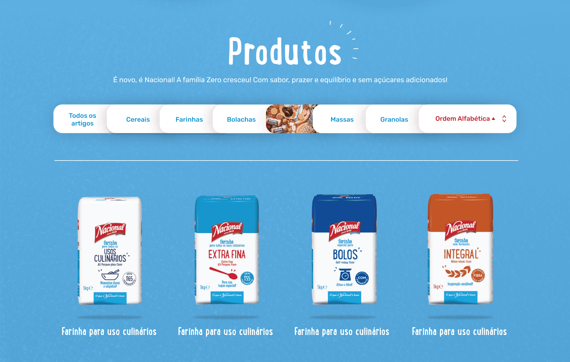
When it comes to products, Nacional relies on a downloadable PDF catalog, which feels outdated and inconvenient. Users expect an interactive browsing experience with clear filtering options. A fixed category menu in the navbar would enhance usability, while adding zoom-in effects and a monochrome treatment for unselected items could improve the visual experience. Each product should also include detailed information such as nutritional facts, descriptions, and related recipes.
Next steps
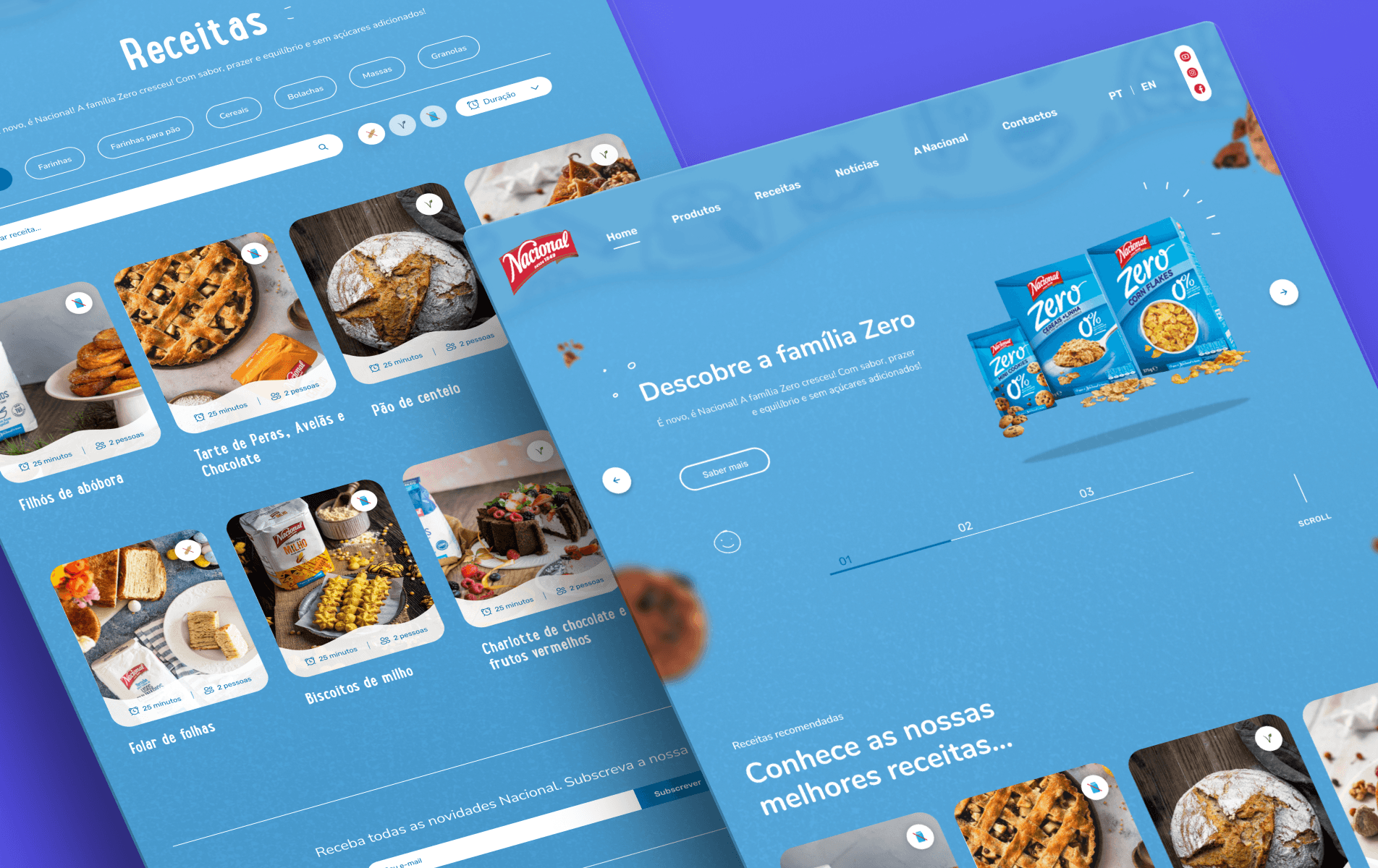
A well-structured redesign can transform Nacional’s website, by improving content hierarchy, refining navigation, and enhancing visual engagement, the site can offer a seamless experience that keeps users engaged. Prioritizing an interactive product catalog, intuitive recipe filtering, and clear CTAs will not only improve usability but also reinforce Nacional’s brand credibility. Moving forward, these insights will guide the wireframing and prototyping phase, ensuring that every design choice aligns with user needs and business goals.

This is what the old version of the site looked like (Retrieved from Wayback Machine)
Understanding the market
Great design starts with great research. To ensure an effective redesign, I immersed myself in the competitive landscape, analyzing brands like Panike, Dancake, and Bauducco to uncover what works, and what doesn’t. Here’s what I discovered:
Content hierarchy: structuring information so users could effortlessly find what they needed.
User flow: guiding users through product discovery and brand storytelling without friction.
Brand Positioning: building trust and authenticity through design and content.
Sketching & wireframing
With insights in hand, I moved into the conceptual phase, exploring different variations and testing placements for key sections, such as product categories, company information, and promotional banners. These early sketches played a crucial role in shaping the final design direction.
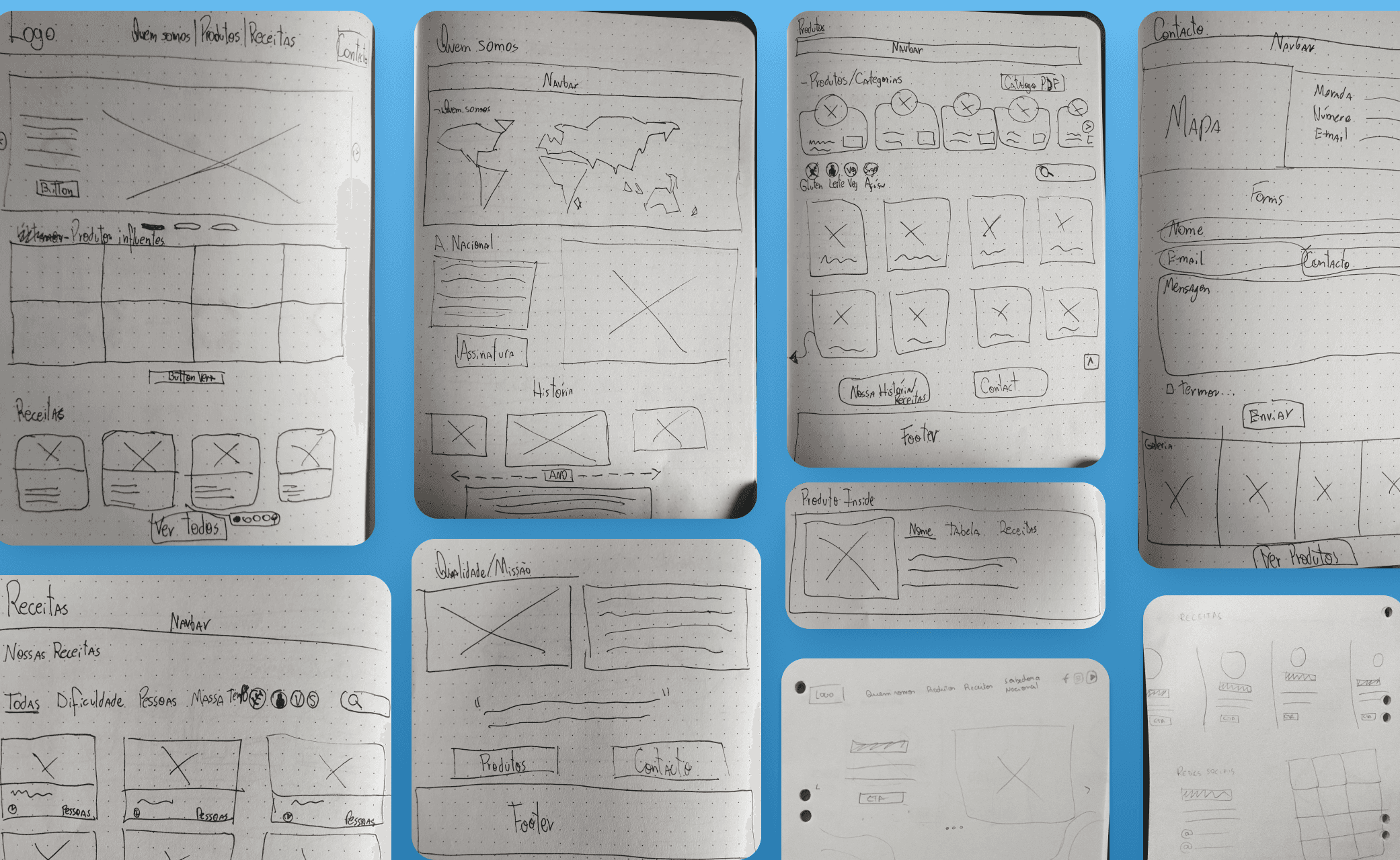
Pen, papers and plenty of coffee
Wireframes
Wireframing was a critical step in the redesign process, where the near-final structure of the site took shape and gained clarity. This stage allowed me to validate content organization, information hierarchy, and navigation flow, ensuring everything aligned with Nacional’s business goals and user needs.
Through an iterative process, I tested, adjusted, and refined key elements, including product displays, recipe integration, and the storytelling of the brand’s history.
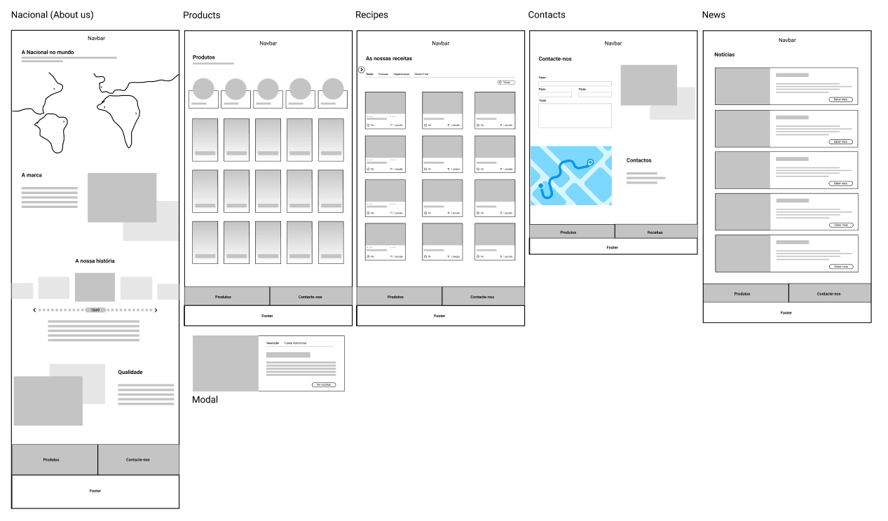
Wireframes overview
Results
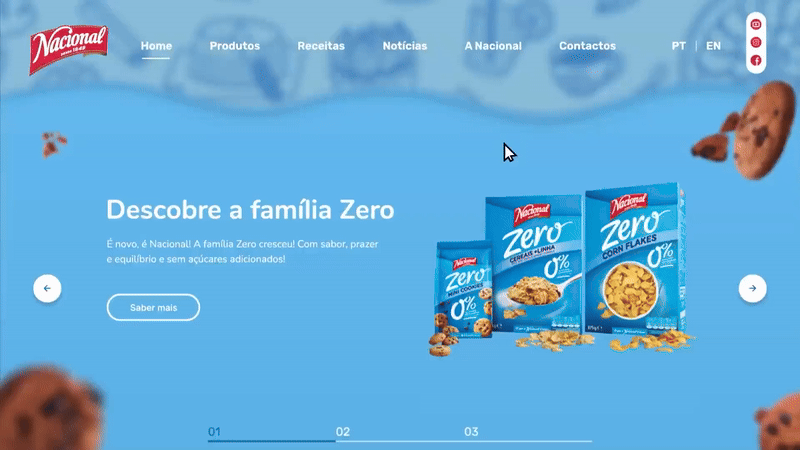
To bring the vision to life, I translated the wireframes into a polished, visually compelling interface. Key improvements included:
Aesthetic refresh: a modern design that honored Nacional’s heritage while feeling fresh and relevant.
Streamlined navigation: a clean, intuitive menu structure that made browsing effortless.
Improved user engagement: a structured, intuitive experience that allows users to explore products and recipes with ease, strengthening their connection with the brand.
Final Insights
💡 Legacy doesn’t mean outdated. A brand’s history is a strength, but its digital experience must evolve to remain relevant.
💡 Strategic research fuels innovation. Competitive benchmarking and user insights ensure design decisions align with real-world expectations.
💡 A refreshed online presence now reflects Nacional’s commitment to quality.
Note: this project was developed as a conceptual propose in collaboration with The Ape - Branding Agency, serving as an exploratory concept rather than the final implemented design.